Design and alternative independent practices
In December 2021, servus.at invited artists and activists working in the field of design into a series of conversations that was called the »Servus D*sign Week«. As an aftermath of these encounters, this article reflects the role of design in the context of alternative artistic and cultural practices.
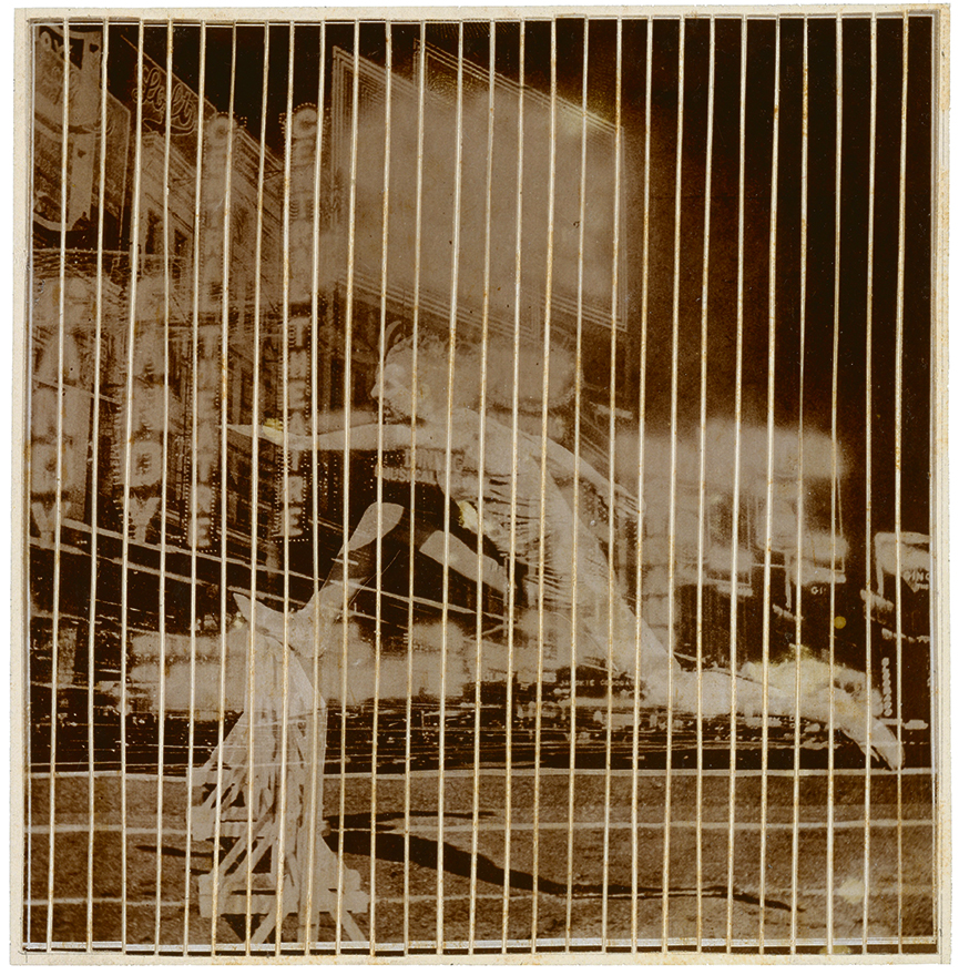
Aesthetics of the Luna Park
»Although old machines give way to new ones, and business models come and go, the one denominator that is ultimately common to all these processes is the errant urge to go faster than before.« Timothy Alborn1
Luna parks offer classic funfair attractions, goodies and surprises, behind a technological display that promises excitement and intensified sensations. A visit to this place is potentially joyful and out of the ordinary, where one can have a taste of novelty and velocity.
Regarded from far, this image is not so different from our late capitalism (❈) in the light of everyday technology, where smooth and bubbly notifications from mobile devices trigger a tiny adrenaline shot in our nervous system, accompanied with the background melodies of flickering information. This scenario shows »ups« but not »downs«, and it is available 24/7. Meanwhile, the dark corners of the Capitalist Luna Park come up as disruptive noise, when attention span is constantly broken and the illusion of access to every possibility leaves a trace of anxiety.
The dichotomy of good and bad (design)
»Every serious artist has a sincere desire to help others reach the goal —the goal toward which all singers are striving: to sing well and beautifully.« Lilli Lehmann, 1902 (✰2)
Design has contributed to a flawless interaction with technology, which helps everyone in the front and back end. Nevertheless, with the way we simplify interaction there is the risk to detach the user from the experience of complexity. A well-designed tool facilitates the interaction with the world, at the cost of reducing and leaving out many possibilities. This extends into a standardization of immediacy, which extrapolates to other areas of life.
Usability reduces itself when the designer neglects how a tool is programmed, wired or produced; when reading instructions or solving a problem is a source of frustration for the user; or when a client or head of a project, cares only about results (★). A generalized disconnection to the technical and procedural side of things emerges, the more we commodify life.
But, how to discuss the pertinence of design principles? The idea of »good design« prevails in high education. At the same time, it keeps a discourse that revolves around itself.
In terms of ethics, for James Auger, design has vandalized the complexity of the world, and it is the responsibility of designers to be aware of these entanglements, in order to promote ethical approaches. »Design good, design better is the problem«.3
True is that, »All design is political. Every design ‘either serves or subverts the status quo’, as Tony Fry argues.« (Pater, 2019)4 When it seems that the aesthetics of »good design« align with the logic of capitalism, it raises the question, whether it is possible to subvert it by refusing its conventions, and how that would work.
In practice, being critical about »good design« through »bad design« is not a valid counter proposal. »Effective graphic design is not about making something look more beautiful or professional, it is about understanding who you are speaking to« (✪). In that case, doing just the opposite would not make any sense, or at the most, would only backfire, creating unnecessary complications or confusing messages.
Challenging aesthetic conventions has been an attempt from the arts, academia and counterculture movements, although the notion of beauty and aesthetics constantly transforms. The joke tells itself when capitalism appropriates back these mechanisms to reinforce its own. When this happens, it is often the moment to leave the tool and reformulate, always looking for new ways of resistance (❈).
After a deep research on the topic, Ruben Pater states, »It suffices to say that graphic design has its uses beyond serving capitalism, has existed before, and will exist as long as people need visual communication.«5 There will always be the need to shape technology, and make decisions. We can see design as a practice that serves the context, and a status quo that is possible to redefine. It should be valid to claim aesthetics and use them in our favour.
Integrating a notion of complexity in the design process and product, demands literacy of technology and information involved in the interaction. Design can propose an information system in which it is possible to navigate, and that communicates through its materiality (✱) in an aesthetical form.
Behind the Great Wheel
»Staying takes time. Coexisting takes even more time. And as Georgia O’Keeffee says, it takes time to see a small flower. Just as it takes time to make friends.« Shin’ichi Tsuji (Oiwa Keibo)6
A new spot in the Luna Park appears. In this place, it is possible to try out slowness while having an unclear destination. There is room for reading or writing a manual, troubleshooting, or meeting at the intersections of synchronicity.
»Slowly but surely«. These processes take time. Working with self-developed tools or with your own infrastructure involves »learning by doing«, knowing that sometimes things do not work, and there is a lot to be done (✫). It can be that servers are not running all the time, and they »don‘t have to apologize for it«. Considering the labour behind technology is a political aspect and part of a process (✧).
In a design brief or life situation, constraints help with making decisions. If every step was slow or ambiguous, it would be impossible to move. Conditions or »pre-requisites« can bring freedom to start a task (★), just as a properly working tool-set (✰).
In the development of open tools, documenting and creating manuals is a practice that feminist pedagogy considers as an act of care that involves responsibility over the users and the tool itself (✩). In making a manual, it matters »how to talk about tools, in a way that is inviting and supportive«. (✧) It is a long process, where the user’s feedback is valuable to keep the documentation ongoing (✺).
Space plays an important role in allowing things to happen. It connects people locally, helps to build trust and to expand a community (✩). The use of public space randomizes the possibility of reaching different audiences outside a small niche, and even inviting grandmas in an academic discussion. On the other hand, providing an infrastructure in an open space means giving something back to a community, while sharing empowering and liberating tools (✰).
While working in a shared space, conversations happen through proximity in space, or having a common communication channel. This relation allows different temporalities, like the ones of work, hanging out, or fixing a printer (✧). Sometimes the start of a project is making new friends (✫).
Alternating roles brings a different consistency to a project. It allows being an amateur or a beginner (every day) (✰). Everyone can contribute from his or her position. A designer can work on making a better copy of a project and finding communication strategies (✪), while a system admin designs a self-made publication (✩) and brings it to open space.
In this squatted corner of the Luna Park, the adrenaline kicks are not automated, but defined by social and life dynamics. Behind there is a motivation: writing a book that was never written, opening a new print studio in the city, sharing a tool, joining a feminist server, reversing everyday technology, working with and for a loved community. These are projects worth working for, which take time. One of the reason to keep going is the passion they trigger, and the reminder »that this is where we find joy« (✫).
-----------------------
This text comes from intertwined conversations; we refer to the sources by pointing to the session where they come from. You can listen to the podcast series in the CBA: https://cba.fro.at/podcast/sdw
The participants of the Servus D*sign Week 2021 are Christoph Haag (★), Libre Graphics Club (✫), Mara Karagianni (✩), Ruben Pater (✪), Potato Publishing (✰), Varia (✧), Cachichi (❈), Juan Pablo Linares (✱), and a system admin (✺) in conversation with Davide Bevilacqua and Gabriela Gordillo.
SD*W was organized in cooperation with Radio FRO and Potato Publishing, supported by Bundeskanzleramt Land OberÖsterreich and Linz Kultur.
Sound design: Cachichi, Web Design: Juan Pablo Linares, Technical support: Sofia Braga and Sara Piñeros. Special thanks to Davide Bevilaqua for the contributions to this text.
Project website: dsign.servus.at

